I didn’t think I had to write a blog for today because the world was supposed to end … but at 12:02 a.m. I realized that I was still on the hook for a blog.
Just kidding. 🙂
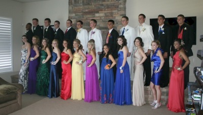
If you read Alex’s post yesterday, you know that I had a very busy Saturday — soccer game, school fair, 22 kids at my house to meet for the prom, and then the problem I have with the ending of my book.
Here are the kids in my family room. Aren’t they lovely? (Mine is the fourth girl from the right in blue standing in front of the white tux.) It was a good day for the school: girls varsity soccer team won their third straight championship and the boys varsity baseball won the first game of the playoffs. Half the boys here were playing baseball only hours before; ditto for the girls playing soccer!)
But back to my problem ending …
I’ve written the last 40 pages six times. Or started to. I write, get to the pivotal climax, and realize that it’s not working. Back track, delete 2-3K words, write, think I’ve nailed it, then it fizzles. I *think* the sixth time is the charm. I’ve gotten farther into the final scene than in my previous attempts last night, and would have (hopefully) finished this afternoon except for all the activities.
Ironically, I had an ending pictured–not really any details, just the location. As the story progressed, I didn’t think that original location would work–I thought I’d have to jump through hoops to get all the players to the same spot. So I tried this and that and another thing and they fizzled. It was my fifth attempt that I incorporated the original location into the ending and that lightbulb went off. I had my missing ingredient. It tied everything together. Now I have everyone at the right place at the right time and it’s not contrived–as if my subconscious already knew there was no other option for these characters at this moment in time.
I’m off to write those final pages while I wait for the teenagers to come safety home from prom, then back from the after prom party nearby. (Which I know will be monitored to keep everyone in line. Not that I don’t trust them. But I was 17 once. A long, long time ago …)
 I need your help. I updated my website last summer and really like it … but I think there are some issues. For years, my web hits have steadily increased, but now they’re stagnant and have been since the change, except for the week or two after a new book comes out. Unfortunately, I can’t really see what the problems are. Like why I need an editor–sometimes I know there’s a problem with a scene, but I can’t figure out what it is.
My web designer put the site together so that the main launch page would be easy to change, to incorporate my new release. We’ll be updating the launch page late this summer prior to the release of IF I SHOULD DIE on 11.22.11. But now’s the time to also incorporate any other changes to make the page stronger.
Please visit my website and help me fix it by answering the following questions:
1) What do you like BEST about my website.
2) What do you like LEAST about my website.
3) Is there any information you’d expect on an author site that you couldn’t find or was difficult to find?
Thank you in advance for your help!
Hi Allison…your website doesn't display on my iPad at all, I just get a black screen. I think this is probably down to the use of Flash on the home page…very limiting with the proliferation of iPads, iPhones, etc.
Enjoyed your blog (reached through Alafair Burke's Twitter).
Regards
John
Allison I like the simple imagery on your website. It has good clear lines. The navigation is clear too.
However it takes longer than most pages I visit to upload a page and then it takes longer than I expect for each subsequent page to load. Whenever I find myself frustrated with how long a page takes to load I try to remember how truly clunky things were a few years back. Yet I think this may be a part of your website issue.
Again the imagery is appealing but your navigation bar, black area and your photo limit the amount of space that is left for written information (at least on my laptop screen).I think having only a couple of inches of information revealed at a time and having to keep scrolling to get to the next couple of inches is a feature that interferes with the transfer of information on your website.
I think the website looks cool, but it's a slow process getting to the information. ( At least for me.)
Congratulations on surviving your very big weekend.All the teens look lovely.
I loved Lucy 2 and am eagerly waiting for Lucy 3.
Allison, the website is beautiful and loaded very quickly for me (even when I clicked to other pages). My issue was the black screen–reading on a dark screen gives me severe headaches. I never stay. That may not be an issue for anyone else, but it definitely is for me.
Hi Alison,
I loved your site. I found my way around easily and it's visually appealing. But, it did take awhile to load on my 5-year-old Mac.
Hi Allison,
I found your design very nice, clean, sophisticated and easy to navigate but a little lean. Perhaps you need to increase your traffic through repeat visitors.
As a new reader I would be very interested in your website, to find out more about you and your novels, however, there appears to be no reason for me to return on a regular basis. I suspect your newsletter would update me to any events or news you might have, so that's not a good reason to go back to your website.
A blog about your creative process, like the piece above, would certainly intrigue me enough to want to return regularly. I don't know how long you have had your Facebook page, but that could be taking away from your website. In fact, it looks like your FB page is more your main focus than your website, much more there to catch my attention. But sadly I am not a "friend" and can not see your posts, but you should be feeding readers from your FB to your website.
I like to think of my website as my hub or home and all things, like FB or Murderati, should lead back to my home. But just like we have to lure our teenagers home, so do you have to lure your readers by making "home" interesting and ever changing with either photos or articles or mystery puzzles/games…anything that can be updated and changed weekly.
And I also could not access your website on my iphone either.
So, there you have it, my thoughts for what it's worth. Happy blogging!
Good Luck!
Carolyn
Hi Allison
It is a beautifully designed website.
However, I found that as others have commented, there is a tiny amount of text. I hate having to continuously scroll in order to read — it interferes with eating, drinking or even knitting while I read! I am forced to interact with the site instead of being hands free.
I love all the info, but didnt' love trying to ferret it out.
I also agree with "heyjude" about the dark screen reading giving me a headache.
But, with that all said, I think that many of us are relying on the quicker "author" fixes such as facebook and twitter. Your question today made me realise that I haven't visited any of my favorite author's websites in months. Instead I follow blogs or facebook…
So maybe websites are the newest dinosaurs, becoming extinct because of the tiny screens of Iphones and the like?
Hi Allison,
Where to start? Your website epitomizes all I dislike about some author websites.
First, the layout: as people have mentioned, the flash on the splash page is problematic for different devices, but even taken on a laptop or Desktop PC (or MAC), it loads slowly, which is always annoying. All of the images on all of the pages load slowly–and the Books page takes the longest. I could go out for pizza before it is done loading.
Next, the overall structure of the site is outdated. I would suggest having your Webmonkeys redesign it based on a blog like blogger or more likely WordPress. You could have a splash page with limited flash and then a standard blog structure for the remaining pages (like Michael Koryta's website at http://michaelkoryta.com/index.php). I'm not saying his site doesn't have problems too, but I'm seeing the structure of a splash page followed by a blog structure more often on author pages these days and I'm liking the clean simplicity of it.
If you want to keep the B/W banner with your photo, then it needs to be moved up to the top of the following pages and I wouldn't have it on the first page at all (again, like Koryta has done). He's also employing a strategy that I'm seeing on a lot of author pages, where the current book is highlighted on the splash page and the art from it is used as wallpaper on the splash page.
The scroll bars on your site are a pain, as mentioned above. Another good reason for a blog type structure.
Another thing to think about is Web clutter. How many pages do you really need in a website? If you switch to a blog style site, you need very few pages. Plus, if we are asking you to add content regularly to your pages (see below) then it needs to be as little work for you as possible. There's something to be said for absolute simplicity in a website. Have a look at Leo Babauta's zenhabits.net. The dude has just 3 links in the nav menu but as much content as the mighty Konrath. Babauta's page is clean and simple though.
Keeping that simple approach in mind, evaluate the pages and content you have now and see what can be disposed of.
About page is really just a collection of links. The Bio is essential and the Q&A is nice. Both are a pain to read though, because of the scroll bar issue. On a blog-style page, they would be much more readable. Also, while a Q&A of 9 questions is nice, a Q&A of 40 questions would be better. The "Links" link is redundant if you go to a blog-style site; links can be placed in the nav menu on every page.
Your Books page is crucial, but you have a lot of books and as pretty as the blonde is, I'd rather see the book images displayed horizontally across the page, so I could see all of them at a glance and know how much you have written–especially if I have just discovered you.
Summaries of your books are nice, but they could be accessed by clicking on each book cover. The Characters list is not needed (leave that for your fans to create on a forum). Booklist in text is not needed either.
You seem to have a lot of events, so I would say keeping an Events page is a good idea for you. But…going with the zen simplicity idea, you could just drop in frequent blog posts with a short list of where you'll be for the next few months (and use a tag like Events, so all the posts can be quickly accessed on the nave menu). One less page to maintain.
The information currently on your News page is minimal–and it should all be on your Books page, because it all pertains to those anyway! If you can show advanced art for the new stuff, then do so.
The information in your Info page can be condensed down into one page with the Contact page (or a series of links on your blog's nav menu).
Now for content, which is King, darling. You need more. Get this blog that you write for Murderati duplicated on your own site if nothing else. Preferably, you would have blog posts of your own on your site that are not duplicated on Murderati also. You need more of "you" on your site. There's nothing that feels personal. Nothing that feels like you had any input into your own site. The site looks like your publisher did it for you and you have the Webmonkeys update it when a new book comes out. Get it turned into a blog and get on there. Give us some personal info about your process.
The 2 questions I want to see answered most on any author's website are the following:
1. What are you working on now? Even if you are secretive about your process or only have a temporary title for your WIP, tell us about it (in vague terms if need be).
2. When is the next thing coming out? You have this information in your News page, but we shouldn't have to work so hard to find it. Also, we want to know when your WIP is roughly estimated to be out. If you really can't say (hmm, maybe in 2012?), then at least tell us that.
Right now, your website resembles a résumé. It should instead be a vehicle of communication for you to tell your readers what you do, who you are, how it's going, and what you like. We should get some personal feeling of excitement from you about what you are doing like in your post above. You already know how to do that (a lot of people don't). So do some of what you are doing here over there.
Everyone has opinions, of course, and we all know what else everyone else has. Still, I've given similar advice on author websites to the following list of folks, often early on in their careers and before we all knew their names: Dan Brown, James Rollins, and Brad Thor. All of them graciously thanked me and implemented some or all of the advice I gave. Hasn't seemed to hurt their Web hits. 🙂
Best of luck, Allison.
-Kane
You're brave to ask for feedback in a public forum about a topic that some people feel very strongly about.
I like your home page alot. I've come to think that getting people to sign up for your mailing list, facebook, twitter, etc is probably the most important function, and you've made that so clean and easy.
I like the look of the rest of the site, but it is hard to scroll through the small boxes of information, and if those pages can't be pulled up on ipads etc, that's a big shortcoming. The content is great, though.
Ah, prom. That picture made me smile. Hope everyone had a blast last night!
And ah, website. I'm tempted to steal this blog for myself…
I think your site is visually stunning. But… I agree with everything that's been said before. Scrolling is a giant pain. The fonts are so small that older readers will have major issues with it. The dark background screams thriller author, but gives me vertigo. Those gorgeous buttons for social links on the front page fall below my full screen on my 13inch Macbook, so I didn't see them until I scrolled down. I'd move all that navigation to the top so it's not lost, because so many people have 13 inch and below. Will boost your SN numbers too, probably. And the fact that the whole site is flash means it doesn't render on the iPad, the iPhone, etc. With the advent of the tablet as a computing device, that could explain the stagnation.
Website design is a pain. I run my own site, and I spend a lot of time trying to streamline it. It's white, too, a choice that many questioned at the time, but it's just so much easier on the eyes. I really like the suggestions Kane made (thank you, Kane – I'll be implementing some myself!)
Thanks for talking about that subconscious helping you get to the end of that last scene. It's amazing, really, how we plant these little mental hints along the way. Glad you figured it out!
Oh, and, um, Kane? Any chance of a critique of JTEllison.com? I'd love to hear your thoughts. jtellison at jtellison dot com
Looks like folks covered mostly everything that I wanted to say.
In regards to the Bio: I found it a bit too long. Perhaps you can break it down into two sections. Bio and On the Writing Process.
Also, there are several mentions of "Coming Soon," but the dates have already passed.
Maybe it's just me, but I didn't care for the character photos. When I read books, the characters spring to life in my mind's eye. The photos are like spoilers.
Best of luck. I look forward to seeing what changes you decide to make.
Visually, I think the site is beautiful. But it seems like it misses your intended audience–most of the text is hidden, and it is so focused on images that it seems designed for people who don't like to read.
Amazing Kane, I never thought of half what you said but agree with it all. Excellent critique that I'm sure many of us will be saving to use on our websites in future… Kc
John: we're already working on a mobile site. The website will detect if someone is mobile and then display a non-flash page. Like many writers, my web guy has a full-time day job and so we work about both his schedule and mine! But it's definitely already #1 on my list 🙂
Catherine: Thank you! I think the site is clean, too–my other site was a bit busier and I wanted to streamline it. But the loading and scrolling are huge issues. I don't have a loading issue, but I'm thinking that the scrolling is the biggest problem.
heyjude: Thank you! I tried to make reading text on white screen — is the black frame an issue, too?
Thank you so much Molie!
Hi Carolyn, thank you! My FB link from my webpage leads to my fan page to "like" since my friend page is maxed out. I don't know how to make my fan page go to the top of searches, because it seems people keep getting my friend page. Very frustrating. I'm thinking about trying to work it out to have my blogs feed into my website, but that's a question for the programmer. I would love to have one place to interact and communicate with readers, but haven't found it yet — especially since FB limits friends, and the pages function is limited in how you can interact. ALL hugely frustrating. Thank you so much for your feedback!
KC, thank you for visiting! The scrolling seems to be the big issue, and I'm going to try to address that in the update. I think that was the problem I didn't see–I liked how everything was on one page–no scrolling down the side–but that created another problem with the smaller scroll window. Forest, trees? LOL.
Kane, what can I say? Do you want a book for your time? Just let me know!
Thank you so much for your advice. The only thing I disagree with you about is the booklist and character list — those are my most accessed pages after books. People have asked me for a list of recurring characters and books, in order. But everything else is definitely on the table to look at. The scrolling is the biggest issue, and I want to fix. I also really like the idea of having all the books visible at once–I'd probably put thumbnails down the left side with a summary to the right. As far as what I'm working on … well, that would be trying to nail the ending of my 11.22 book! My 2012 book is tentatively called SILENCED and tentatively scheduled for May, so because it's not confirmed I don't generally like to post to my webpage.
I had a dear reader letter on my old website incorporated to the main page. I think I should have something similar for the revamp–not a long letter, but something personal because I think you're right, people like that I can be chatty 🙂 It's more personal. I can't have a third blog on my personal page, but I can certainly incorporate the two group blogs I'm on. (I had a personal blog and just didn't have the time to maintain it, and I just didn't have fun doing it. Murderati and MSW are my communication vehicles after Facebook.) But I like the idea of having some sort of place to go where everything is right there — like my most recent blogs, my facebook updates, even my twitter feed. (I personally don't care for twitter, but it seems to have a purpose, and there is definitely a different audience between FB and twitter.)
Thanks again! I have a character named Kane. He's off-page in most books, the mercenary brother of my hero Sean Rogan. I suspect he might finally have a couple scenes in book #6. Not certain, however … since I don't plot, I don't know what's going to happen in book #4 that I'm starting next week, let alone #6!
Whatever you do, don't get rid of the story synopsis and the character lists. Those are gold! Your content is fantastic.
@Alafair: Thanks for so delicately pointing out that I was being a bit overbearing. I get that way because I care. 🙂
@JT: With pleasure. I'm writing up several pages of notes right now. Will take me some time–you have a lot of content! And asking for me to look at your website just got you another reader, because the new book sounds fantastic. (My ancestors were Scots, so anything set in the highlands snags my attention immediately.)
@KC: You are welcome. I try. 🙂
@Allison: Thanks for the offer of a book. Why not send me an ARC or an e-book of If I should Die, once you have one, and I'll review it on my own blog and get reviews up on sales sites like Amazon and B&N for you too.
If that's the case with the Character and Book lists, then by all means, keep them! 🙂 A great lesson for all of us–sometimes the fans really dig the minutia.
If I had taken the time to look first, I could have saved myself some typing by simply saying: have a look at Alafair's site. It's great and incorporates a lot of what I was suggesting. The Dear Reader letter sounds pretty good too, and yes, one central location where people can view your most recent blog posts, FB posts, and Twitter posts is a good idea.
Finally, let me say two things. First, Murderati is a great idea. I knew only one author on here (Brett) when I first visited the site. I don't normally read serial killer, legal thriller, medical thriller, or romance thriller, so a lot of you were off of my radar. But because of Murderati, I've picked up Zoë's and JD's books, and I literally pick up all of your books in my hand when I see them in the store and check out the jacket copy (hoping that it will be the one to make me a convert). I'll probably get around to reading each of you, even though your specific subgenres might not be my normal cup of tea. In the meanwhile, I turn your books face out on the shelf at the chain stores if they aren't already. Hard to explain this but I respect all of you and like what I hear in your non-fiction work–even though I don't read most of your books. I do however, recommend you all to readers I know that do devour your specific genres and subgenres.
The second thing is a little shameless self promotion. I've been doing some freelance editing for thriller authors wanting to go the self published route with ebooks. If anyone is thinking of making that leap and you need an editor, get in touch. Affordable rates, scads of experience and qualifications, and a persnickety attention to detail. I'm looking to take on new clients.
-Kane
Allison, this is incredibly cool and brave, and honestly, I'm going to be referring a lot to this post. We're redesigning the shop website out of a grinding need to try to stay relevent and seemingly cutting edge (it's making me so grembly I'm twitchy about it), but all these points are things I need to keep firmly in mind, and I'm learning a ton!
Then too, if I ever get my Ask The Author website up and running, all this info is DEFINITELY gonna be important!
Thank you!
Since everyone's already said all sorts of wonderful things, I'll keep this short.
I REALLY like the layout. It's simple and cute. I didn't have loading issues. And I think the coloring (or lack of it), I don't know, matches the atmosphere of the books 🙂
What I don't like is that character info is on pdf. On your other site, when I was first reading your books, I had the character info page on my bookmarks so I could go back and see what favorites were in the book before I read it. I'm always hesitant to open a pdf file because Adobe is a pain.
🙂
Love the look, but agree with the others, the text boxes are too small. Personally, I absolutely hate flash and generally navigate away from sites that employ it as much as your does, but that's just me. However, I do think you're missing out on a lot of iPad users because it is flash based. Overall it is very pretty, but not very user friendly.
Hi Allison. It's a very very striking and beautiful website. Very atmospheric. But, yes, I do agree with the others. It does take longer than most other websites to load, and the delay when surfing between sections is particularly jarring.
I faced that exact same problem on my own Flash website. My solution to that was to have everything load simultaneously at start-up. That way, the transition from section to section is more seamless.Just click, click, click and whoosh, whoosh, whoosh. Something you could suggest to your designer, perhaps? It's a simple tweak, but it makes all the difference.
Hope that helps! =)
@Kane — email me your snail mail and email and I'll find a way to get an advanced copy to you. I don't think my publisher will be doing arcs since this is my last book with them, but they'll send out review copies a few weeks before pub date. It's the third book in a continuing series and I hope that it stands alone even with the series characters, so you'd be a good test case! (she says with much worry and trepidation.)
@Kim C: thanks, and you're another vote on the text boxes. And the mobile site is coming, it needs to be programmed, and I think I'll hold off so I can do everything at once.
@Barbie: Thank you! I'll see what I can do about putting the character and booklists up as html with pdf as a downloadable option.
@Fran — good luck with your new site. I think you hit it–it's hard to be cutting edge and also be interesting and easy to navigate. I like so much about my site because it's different, but now that people have mentioned it, the scroll boxes are what the problem was that I couldn't see.
@JT — thanks! I'm definitely not getting rid of the book and character lists. That was the number one thing my readers kept asking for that I didn't have on my first website. I strongly recommend that all authors have a printable booklist, in order, by series. Readers really like to know which books go together, which connect, which stand alone. Because I have connected trilogies (though they can stand alone), they like to know who is in which book.
@Karin — LOL, I didn't think that it was so image heavy it was almost anti-reader! I wanted to minimize scrolling and ended up with too LITTLE text.
@Amy — good point about the bio, I haven't edited it in a long time. I'll separate it out into two "articles" or a long bio and short bio. I also used to have a press page and that disappeared, but I need that back (which direct links for book covers, photos, bios, etc) … on the images, they were supposed to be snapshots of pivotal scenes more than characters. But I can see how people would think they're characters.
@Alafair — So at Kane's suggestion I checked out your site and love it! 🙂 I particularly like your Duffer pages … I should give my cat Nemo his own page. And I love the graphics too because they're sharp and clean and different. I'm going to keep a launch page but like the idea of subsequent pages being more straightforward.
I don't know how brave I am, I really wanted opinions. I'm good at pulling out what works and what doesn't, and I don't mind criticism — obviously, since I read all my reviews, bawahahaha.
A lot to think about and put into a coherent memo for my brilliant web guy! 🙂 Thank you so much, everyone!
Allison part of my issue with the pages loading could be my current location. I've noticed my wireless broadband is a bit less reliable here (regional Australia) than in the city. I'll test this when I get back to the city tomorrow. Maybe this is an issue across your big chunk of land and globally too?
It was interesting to read people's feedback on what affects them when using a site. I like John's solution as a compromise if you really want to keep your flash. On entry of a website, I find people have a certain amount of patience for loading because they can always check an email, read some news etc when flipping back and forth. However I think it's the waiting for each page, and link within the page, to load that really detracted from some of the great features of your site.
I didn't get to the character page because navigating through each section was taking too much time.
I'll be interested to see what changes from this blog post/ comment stream get incorporated into your website over time.
Good luck.
You are indeed very brave asking for feedback in such a public forum Allison
II concur with a lot of the comments here but especially Kane's well thought out points. My own additions
Flash is just annoying these days (and as others have said unusable on many devices)
having a single domain name with no sub-domains or individual links makes it hard for people like me (I blog about books) to link sensibly to the site. if someone were to blog or write online about one of your books they couldn't link directly to it – they'd have to link to your website and say something clunky like 'then click on books then second one from the top'. UGH.
The content is fine – for me it's just the organisation of it and access to it that are the problem – the scrolling that others have mentioned is very annoying (again especially if you try and access the site through a smart phone or anything else with a smaller screen) I do agree that feeding in more current material like your blog posts, FB updates would help – even if most people access that information from elsewhere if someone new comes across the site they will like to see something current which is evidence that you're a current writer (I stumble across websites all the time where you can't tell if the person is still writing).
Good luck with the review of your site
Hey, Allison,
I came too late to the game, I think. But I'm considering doing a straight-out blog website rather than messing with tons of pages etc. Yours is a gorgeous site, but I would've jumped ship after the first flash. I don't like waiting for graphics and the way yours load takes more time than I have patience for when I'm checking out sites.
I found your lovely static photo on each page to be too static for me. And it made me wonder why you needed us to keep your face in mind rather than the content of your books and fiction overall?
Finally, the news page is really out of date (my website is even more out of date!!!) and reading it made me wonder about content on other pages. Were they stale too?
I think Kane and others have wonderful insights that come from people who spend far more time surfing than I do.
Thanks for putting your site up for comment. I've learned a lot today.
Ditto for me re ipad. Also on the loading and scrolling. I also don't like pictures of characters unless they are just suggestions (like a shadow figure). I like to make up my own images. I think they take the focus away from your work as well. I like simple and uncluttered as much as possible.
Hi Allison,
At this stage I think I'm just another number in the already tipped scales, but…
1. Each page took several seconds to load and I'm on desktop computer. Would definitely make me click away.
2. While I like the visual nature of the site, I think the down side (the small section for words and the scrolling) is too great.
3. I wasn't mad about how much information was stored in PDF format. Although you could bring it all into HTML when you have more text real estate on screen.
Kane – feel free to rip into my site too! http://www.pdmartin.com.au
Phillipa
This is the best articles I've ever seen. Thanks for your sharing